

Artist & Craftsman Supply Store
Artist & Craftsman Supply is a 100% employee-owned company. It is one of the largest art material suppliers in the United States. Their goal is to continue to shape their company as a vital resource in support of the creative spirit.
Role: User Experience & Interface Design
Project Team: Iris Minji
Tools Used: Pen/Paper, Sketch, Photoshop, InVision
Platform: Desktop
Timeline: 2 weeks
The Challenge
Artist & Craftsman is currently not well-equipped to succeed in the ecommerce market. Many online art supply stores offer efficient features that help customers in completing the checkout process. Artist & Craftsman has an outdated website design with very few of the features that consumers expect.
“Consumers struggles to purchase art supplies on Artist and Craftsman website because it is overwhelming.
Our solution should deliver an easy way for our costumers to shop & proceed to an efficient checkout so they can be prepared for their upcoming art projects.”
Integration & Research
Heuristic Evaluation / Site Mapping / Competitive & Comparative Analysis / Persona / User Flows / Interviews / Survey
I first had to understand what users thought of the current site. I tested the site on multiple people to find out how the site flowed, whether they could achieve certain tasks, thoughts on the design and whether they have bought art supplies online. Different people rely on different features to gain confidence that their online shopping meets their expectations.
How might we help the users have a better online shopping experience?
Heuristic Evaluation
To understand the user complaints regarding the shopping experience, I ran a heuristic evaluation on the current website. The heuristic evaluation was focused on the key task flow which was to locate an item and purchase it through the check out process.
I used Jakob Nielsen's 10 general principles for interaction design. They are called "heuristics" because they are broad rules of thumb and not specific usability guidelines.
Match between
System & the Real World
The system should speak the users' language, with words, phrases, and concepts familiar to the user, rather than system-oriented terms. Follow real-world conventions, making information appear in a natural and logical order.
4
4
Aesthetic & Minimalist Design
Sometimes, the interface is too cluttered with a lack of hierarchy. Which makes it very difficult for us to focus or function properly.
4
Flexibility & Efficiency of Use
Accelerators, unseen by the novice user, may often speed up the interaction for the expert user such that the system can cater to both inexperienced and experienced users. Allow users to tailor frequent actions.
4
*severity rating 0-4, 4 being most severe
Current site map to show you how the site is "organized"
Current Site Map
.png)
Persona
To synthesize my research findings, I created a persona, Melody Monet, as a reference to the user I was designing for. She usually buys her supplies in-store, but occasionally buys online when she knows what to exactly buy. She is a busy modern day woman and doesn't want to spend too much time shopping.

Journey Map
Melody's Journey Map shows her struggles throughout her online shopping experience. She struggles to find the items she needs and is frustrated without the checkout process.

Featured Prioritization


Improve visual design & aesthetics of the overall website.
Navigation that allows users to access their trusted familiar products quickly.
An overall smoother and more efficient checkout experience.
Design Process
Design Studio / Sketching / Wireframes / Paper
Prototypes / Inspiration / Hi-Fidelity Mockup
"Accessible design is good design." Steve Ballmer
Conducting usability testing with paper & medium digital prototypes helped identify problems that led to solutions. I did testing on 5 people in-person for each test and made adjustments to the design based on feedback.
Low-Fidelity Prototype
Low-fidelity wireframes & prototypes helped me explore and redesign more concepts, interface alternatives, and screen layouts.
I learned that users often wanted to search the item(s) they were looking for and
have related products and popular products as options.

Medium-Fidelity Prototype
Medium digital prototypes helped me redesign the user journeys and the flow.
I got to test my medium digital prototype at the Artist & Craftsman store in DTLA with 3 employees. They were aware of the current A&C website being very outdated and hard to use. I tested my mid-fi prototypes and made adjustments to the design based on their feedback- which was to really emphasize the search engine bar as well as some minor adjustments on the checkout process.


Design Inspiration
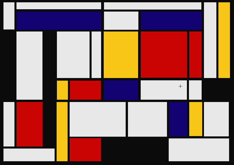

Piet Mondrian inspiration came from Mondrian Walls at multiple Artist & Craftsman Supply Store's physical locations around the United States.
High Fidelity Wireframes
Website Landing Page with a search function, Shop by Departments Page, Footer, Category Page, Product List Page, Added to Cart


Streamlined & Redesigned Checkout Process Pages


Final Prototype

High-fi prototype was made after numerous rounds of testing and iteration.
Clickable Prototype: https://invis.io/FARTAGOTD8X
More Work

The Boring Company
